[ad_1]
For Arjan Dugal, the trick to a good design lies in the small details. A finance and economics major with a penchant for Indian textiles and artforms, Dugal is the son of late model-designer Simar Dugal.
While he had launched his eponymous menswear label in 2014, he took over as the creative head of the label Simar Dugal in August 2021.
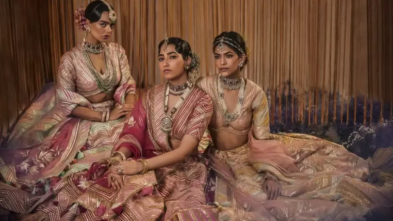
Lounge spoke to him as he unveils a new collection, “Mahaaba by Simar Dugal”, at Ensemble in Mumbai and Simar Dugal studio in New Delhi this month. The collection will also be retailed at the Simar Dugal flagship store opening soon at Emporio, New Delhi. Edited excerpts:
Your new collection ‘Mahaaba by Simar Dugal’ is rooted in heritage textiles and embroideries. Could you tell us about the inspiration?
When mom passed away (in 2020), I was going through her collection of textiles and shawls she had kept away for years. That work, that old world charm, was so absolutely stunning. I wanted to do a line celebrating those fabrics and textiles while adding a modern touch to it.
How much did your mother inspire and shape up your vision and overall aesthetic?
It was all her. My aesthetic, look, feel, appreciation of Indian fashion and culture and its incorporation into our brand has been primarily due to her personal love and appreciation for Indian culture and fashion. There might be a contemporary touch, but the overarching aesthetic is very much hers.
Was it a challenge to take over the Simar Dugal label at the outset? How have you added your signature touch in an attempt to revive the label?
It was indeed a challenge. Being a menswear designer with a minimal touch, I had to explore aspects of maximalism and traditional ethnic aesthetic before I could start, let alone add on to the design aspect of Simar Dugal.
I don’t think the label needed reviving per say but it did need a modern twist. Fashion, particularly Indian fashion, is at the peak of evolutionary morphism, from silhouettes and treatments to even amalgamation of treatments and embroideries, so an in-depth study into our USP and a feeling of where to take it was step one. As far as straddling both labels goes, it’s been interesting to say the least. One is a minimalist approach with subtle accents and the other is point blank contradictory. The underlying aspect though to both has to do with celebrating our clientele and their desire to express themselves in our clothes.
What are the key festive and bridal trends this season?
I feel the overarching trend for both labels is one that has been around for a while. A good fit, a silhouette that complements the body shape is a must. And more so, for men. As trends go, for brides, less is more. Simpler colour blocks, fun hues, cool prints, morphing of treatments, and reinventing embroideries and placements are key. For men, less is more; a self on self design, even if it’s loud… doing it elegantly.
The Indian menswear space is increasingly inundated with labels offering similar silhouettes and surface texturing. How does your menswear stand out in this competitive space?
I don’t go just for the look. It’s about the look and feel. It’s about what feels right. Printed linings, phone pockets, collar shapes… the key in menswear lies in the details. Like you said, surface texturing is inundated, but I say to you, it’s what goes on under the surface that makes that product. It’s not about looking a certain way, but a feeling which is luxury.
[ad_2]
Source link