[ad_1]
Footers are often neglected on ecommerce websites.
Some businesses view the footer as a graphic element to end a page. Others consider it a standard navigation menu. But done correctly, this seemingly small piece of a website carries high value for brands.
Footer Menu
The footer can have a variation of your top navigation. Differing from the main navigation becomes an opportunity to serve two audiences, each using the navigation elements differently.
For example, the top navigation can focus on first-time visitors, while the footer navigation could serve repeat users and a broader audience. Regardless, consider the footer menu your opportunity to showcase navigation in a new order or appearance.
Take Ipsy, for example, a beauty subscription service. The site’s top menu has just two buttons, “Log In” and “Get Started,” while the footer includes full navigation. The design simplifies the decision process for first-time users while allowing anyone to view all pages upon reaching the footer.
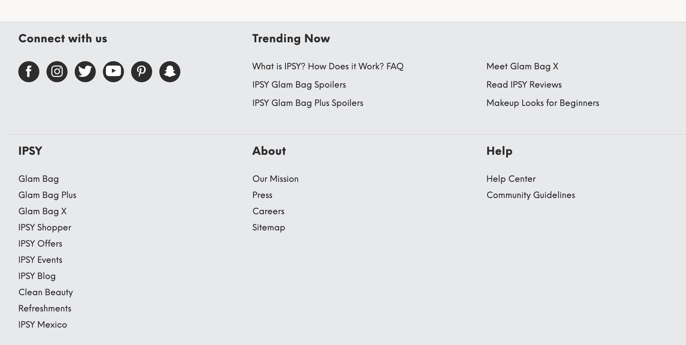
Ipsy’s footer includes full navigation, helpful for anyone to view all pages.
Calls to Action
Including a final call to action, such as a newsletter signup box, at the end of the page facilitates quick lead acquisition. It’s where the scrolling ends, and our eyes are more attentive to content.
Mobile users will often subscribe to newsletters through footer signup boxes and reengage with the brand from other devices.
An important consideration when adding a newsletter subscription box is to make it simple and easy. Display in the footer only one field, ready for an email address. Collect other data later, such as name and phone number.
Take Olipop, a maker of healthy soft drinks. The site’s footer includes an email field — clear and ready to complete.
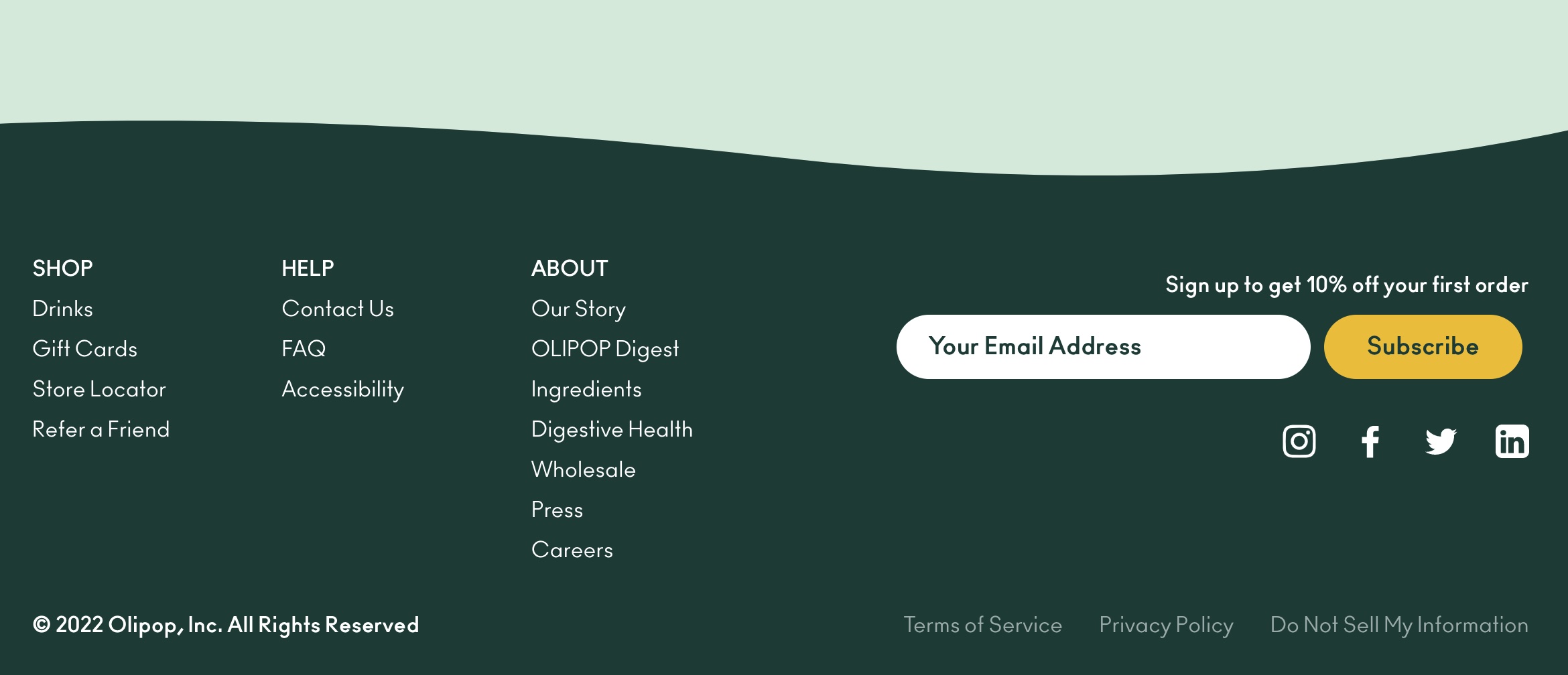
Olipop’s footer includes an email field on the right (“Your Email Address”) — clear and ready to complete.
Get Creative
Footers do not have to be small or narrow. Creativity applies to footers as much as the rest of the site.
The website of Treecard, a seller of wooden credit cards, takes an innovative approach with its footer. It contains beautiful graphic elements and the brand’s mission in large bold letters.
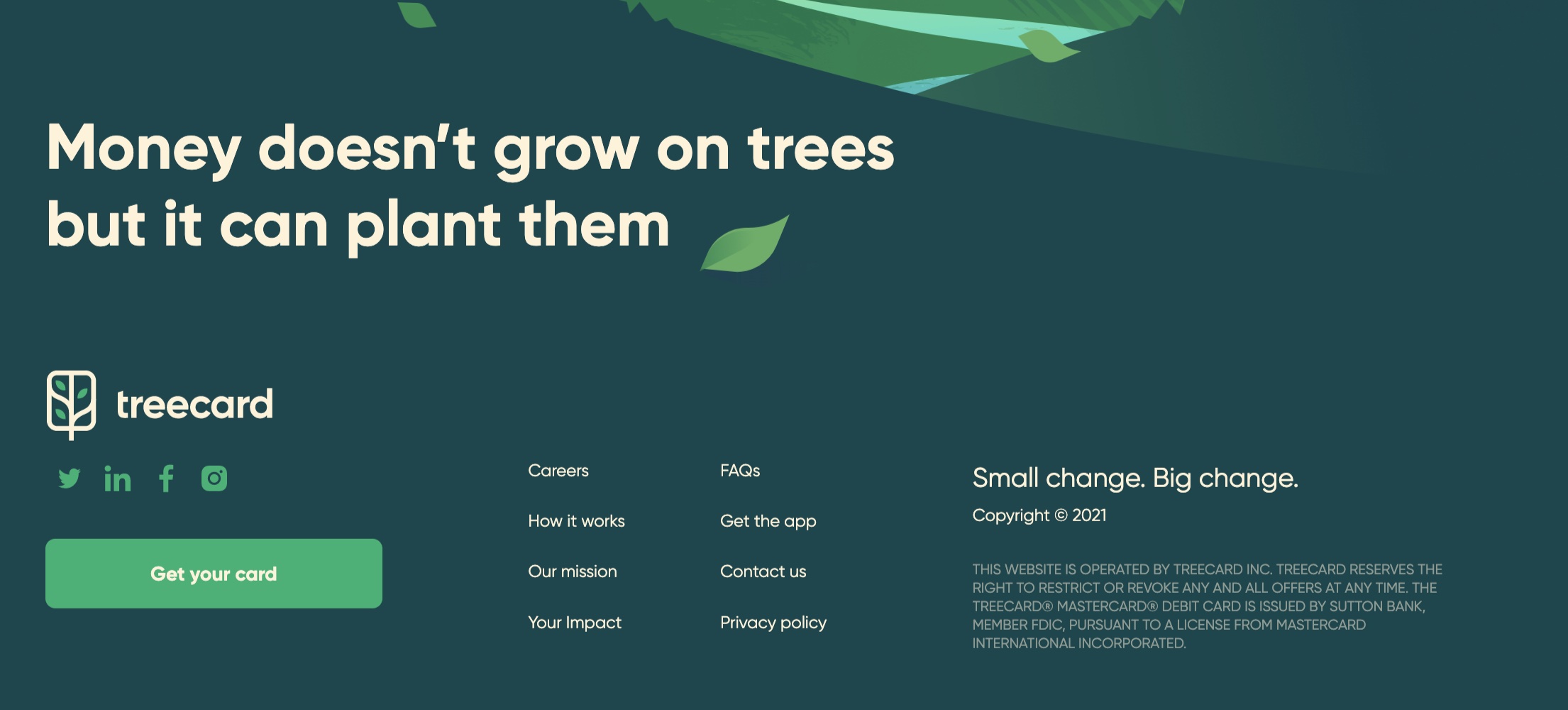
Treecard includes its mission statement in the footer — “Money doesn’t grow on trees but it can plant them.”
Keywords
Footers can be an excellent location for search-engine keywords. Use keyword-rich navigation and paragraphs that are useful for conversion and organic search.
Oberlo, a drop shipping platform, has a simple explanatory sentence on the left of the footer (“Start a business and design the life you want — all in one place.”) and keyword-rich links on the right. A footer can accommodate several keyword-optimized sentences without becoming annoying for visitors.
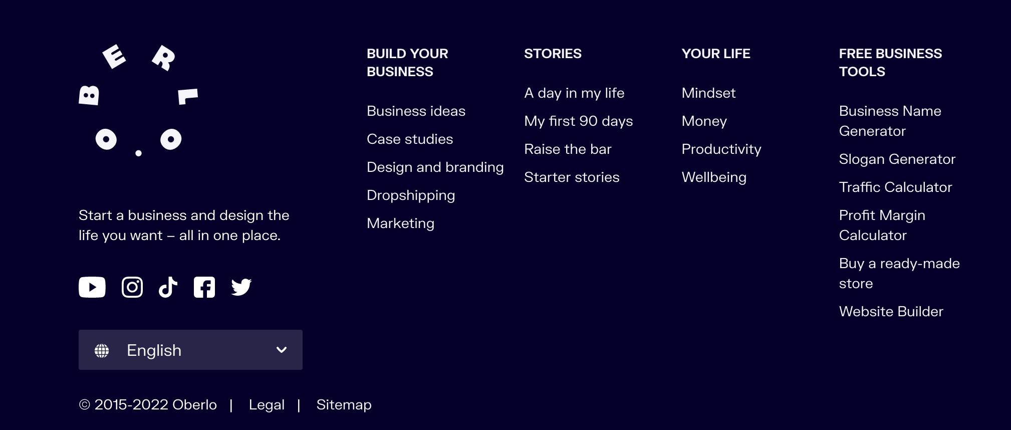
Oberlo’s footer has a simple sentence on the left (“Start a business and design the life you want — all in one place.”) and keyword-rich links on the right.
Promote Social Media
Finally, showcase your social media feed in the footer. Vivoo, a provider of at-home health tests, shows social posts in its footer. This strategy is effective for enticing social media followers and thus generating leads.
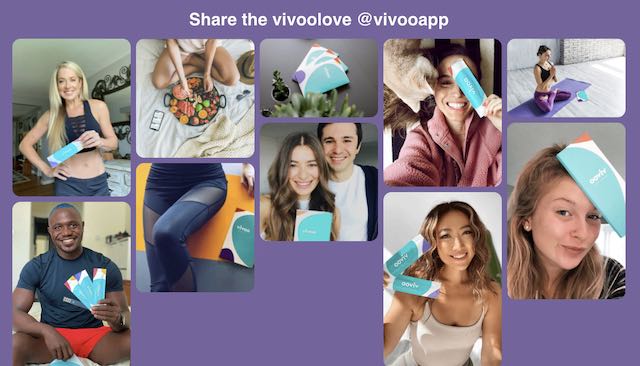
Vivoo’s footer displays select social media posts, enticing visitors to follow.
[ad_2]
Source link


